<CardTable />
Este componente esta disponible en el paquete: @nubeteck/prime.
📖 Descripción
CardTable es un componente compuesto entre DataTable y TreeTable. También soporta un titulo para la vista asi como filtros avanzados, búsqueda y acciones.
🔧 Propiedades
Este componente acepta las siguientes propiedades:
type ICardTableProps<T extends object> = { title?: string; subtitle?: string; hideSelectFilter?: boolean; /** * To hide global search input. */ hideGlobalSearch?: boolean; columns: IDataTableColumnsProps<T>[]; /** * To hide the filter settings icon. */ hideFilterSettingsIcon?: boolean; /** * Value assigned to the filter dropdown. */ valueFilter?: any; onRefresh?: () => void; filterOptions?: SelectItem[]; onClickFilterSettings?: () => void; onSearch?: (value: string) => void; /** * Actions for the top of the table. */ headActions?: React.ReactNode[]; onSelectFilterOption?: (value: any) => void; /** * Actions for each row in the table. */ tableActions: CardTableActions | ((rowData: T) => CardTableActions);} & (CardTreeTableProps | CardDataTableProps<T>);| Propiedad | Tipo | Descripción |
|---|---|---|
| title | React.ReactNode | Titulo del componente. |
| subtitle | React.ReactNode | Subtitulo del componente. |
| type | string | Desde esta propiedad puedes cambiar el comportamiento del componente. |
| hideSelectFilter | boolean | Desde esta propiedad puedes ocultar el campo de filtros. |
| hideGlobalSearch | boolean | Desde esta propiedad puedes ocultar el campo de búsqueda de la tabla. |
| columns | ColumnProps[] | Un arreglo de columnas para la tabla. |
| hideFilterSettingsIcon | boolean | Desde esta propiedad puedes ocultar el icono de ajustes de filtros. |
| valueFilter | string | Valor para el campo de filtros. |
| onRefresh | Function | Un callback que es llamado cuando se da clic en el icono de refrescar datos. |
| filterOptions | object[] | Opciones disponible de los filtros. |
| onClickFilterSettings | Function | Un callback que es llamado cuando se da clic en el icono de ajustes de filtros. |
| onSearch | Function | Un callback que es llamado cuando se da escribe texto en la búsqueda del componente. |
| headActions | React.ReactNode[] | Un arreglo de componentes para colocar a la derecha del header. |
| onSelectFilterOption | Function | Un callback que es llamado cuando se selecciona un filtro. |
| tableActions | TableActions | Un arreglo de componentes para las acciones de cada fila de la tabla. |
| value | object[] | Un arreglo de objetos que se mostraran en las filas dependiendo de la columna. |
| loading | boolean | Desde esta propiedad puedes cambiar el comportamiento de la tabla a cargando. |
⚙️ Ejemplo
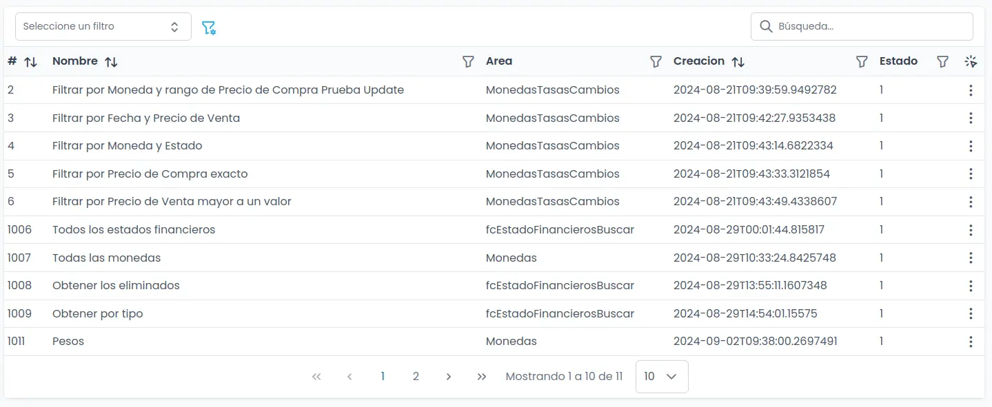
const FiltersPage = () => {  const filters = useGlobalQuery("Filters", "getAll");
  const columns: IDataTableColumnsProps<IFilter>[] = [    {      header: "#",      sortable: true,      field: "FiltroId",    },    {      filter: true,      sortable: true,      field: "Nombre",      dataType: "text",      header: "Nombre",      filterMatchMode: FilterMatchMode.STARTS_WITH,    },    {      filter: true,      header: "Area",      dataType: "numeric",      field: "FiltroAreaNombre",      filterOperator: FilterOperator.AND,      filterMatchMode: FilterMatchMode.EQUALS,    },    {      filter: true,      sortable: true,      dataType: "date",      header: "Creacion",      field: "FechaCreacion",      filterOperator: FilterOperator.AND,      filterMatchMode: FilterMatchMode.DATE_IS,    },    {      filter: true,      header: "Estado",      field: "EstadoId",      dataType: "select",      filterOperator: FilterOperator.AND,      filterMatchMode: FilterMatchMode.EQUALS,      filterOptions: [{ value: 1, label: "Activo" }],    },  ];
  return (    <CardTable      type="data"      title="Filtros"      columns={columns}      value={filters.data}      loading={filters.isPending}      subtitle="Todos los filtros"      tableActions={[        {          icon: "trash",          label: "Borrar",        },        {          icon: "pencil",          label: "Editar",        },        {          icon: "x",          label: "Cerrar",        },      ]}    />  );};